ACRE / Campaign concept · Art direction · Copywriting
Gold.
Up close.
Making gold worth a closer look. A campaign direction built around the product itself: its surface, its form and the details you would notice in your hand.
A fresh campaign concept developed from our earlier Acre design work.
Inside the idea ↓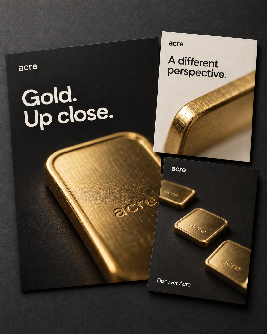 View full artwork ↗
01 / The idea
Start with something
you can see.
The creative challenge was to give a small gold bar a strong presence in a campaign. We chose a close view: the edge, the brushed surface and the way the metal catches the light.
“Gold. Up close.” connects the image and the message. It invites someone to look more carefully, then explore the product. That gives the campaign a clear starting point before any detailed product information.
Let the product fill the frame.
The large crop makes the gold the first thing you notice. A short headline leaves the image room to work, including at thumbnail size.
Change the view, keep the idea.
The ivory layout moves closer to the edge of the bar. The lighter background changes the pace while the typography keeps it part of the same campaign.
Make the invitation simple.
“Discover Acre” introduces the brand with a wider product view. It gives the viewer one clear next step after the close detail.
02 / The design
Three layouts.
One recognizable direction.
Charcoal gives the gold contrast. Ivory gives the series breathing room. Consistent typography and a simple Acre wordmark hold the layouts together.
The result is a campaign presentation with a clear sequence: catch the eye, show the detail, introduce the brand. Each layout has its own role while staying recognizable alongside the others.
Portfolio reinterpretation with generated product imagery and mockups. This page presents the creative direction, without claiming live campaign performance.