HUSK / Brand strategy · Identity · Copy · Website · Social
Everything
on a plate.
A hospitality business with a broad offer: helping restaurants, bars and hotels take shape, from the first concept to opening. We refined the existing logo and built the wider brand around it: mission, vision, copy, a brand deck, social media and the website.
Original client work, reconstructed for this portfolio from the surviving designs.
Explore the working prototype ↗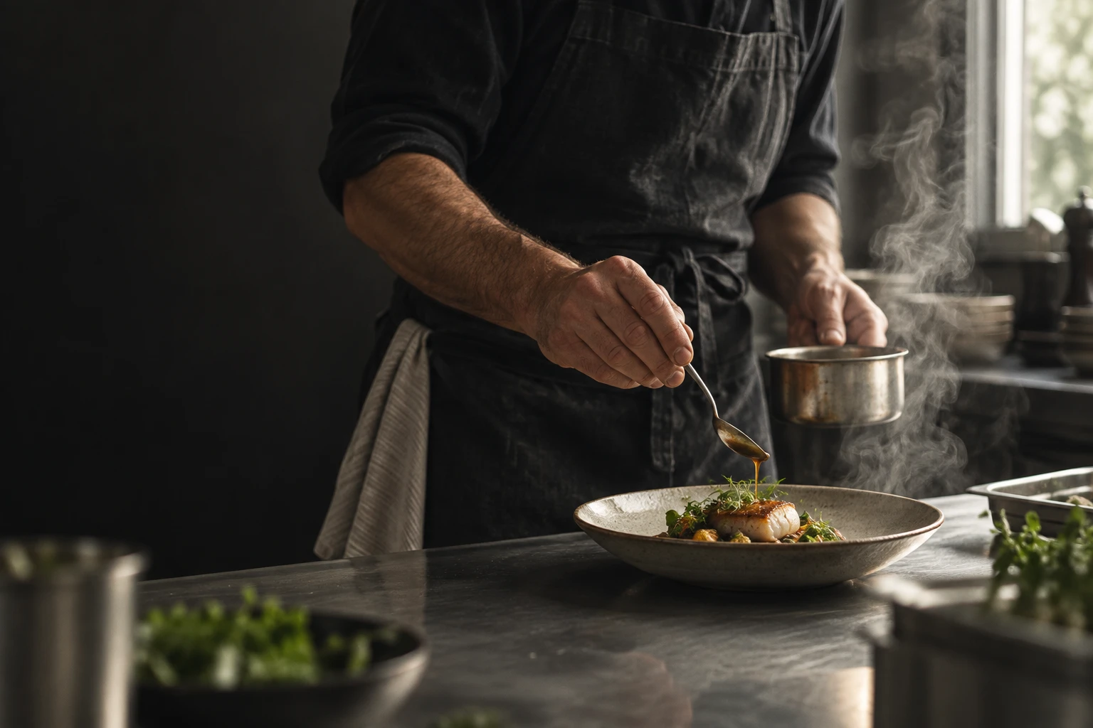
01 / The business behind the brand
A complete service.
A clear first impression.
Opening a hospitality business involves many connected decisions: the concept, its identity, the food and drink offer, and how the guest experiences the space. HUSK brings those parts together.
Our task was to give that breadth a clear expression. HUSK already had a logo. We refined it, then developed the words, identity and communication around it so a prospective client could understand the whole offer.
Make the offer clear.
Explain the full-service hospitality proposition in a short, memorable line: “Everything on a plate.”
Let the detail speak.
Use food, materials and interiors to communicate the kind of experience the business works towards.
Connect every channel.
Carry the same restrained design language from the identity to the website and social content.
02 / Strategy & copy
Give the business
a shared story.
The work extended beyond the visual identity. We wrote HUSK’s mission and vision statements, developed the copy and brought the brand together in a deck.
Those pieces have different jobs: the mission explains the business’s purpose, the vision sets its direction, and the customer-facing copy makes the offer understandable. Together with the visual identity, they give the website and social content a common starting point.
“Everything on a plate” expresses the breadth of the offer in the language of hospitality. The website and social designs expand that short line into food, people, spaces and service.
03 / Identity refinement
Room for the
hospitality to shine.
We refined HUSK’s existing logo into the wordmark and variations shown here, then developed the wider identity. Widely spaced lettering, a circular logo variation and a palette of charcoal, white and warm greys set the tone. It creates a calm setting for the more expressive elements: food, light, texture and the people behind the service.
The original brand board provided the reference for the rebuilt presentation below: logo variations, the documented colours and a restrained hierarchy. The same rules connect the identity to the new photographic direction.
for the whole experience.CHARCOAL · WHITE · STONE · GREY
A quiet identity.
A rich world around it.
The neutral palette lets the photography change without making the brand feel inconsistent. A cocktail, a dining room and a plated dish can belong to the same visual world.
The original guidelines specify Visby Light and Garet Book. The reconstruction uses a light sans-serif substitute while preserving the spacing and hierarchy.
04 / Website
Show the experience.
Explain the expertise.
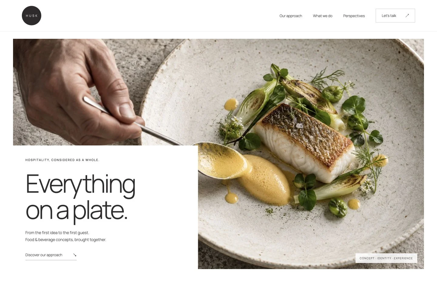
We wrote and built the website, pairing large hospitality images with concise service copy. The opening introduces the proposition; supporting sections bring the team and the full-service food and beverage offer into view.
This gives the imagery a practical job. It draws people into HUSK’s world, while the copy explains what the business can help them create.
Find the right setting.
Switch between restaurants, hotels and bars to see the service explanation change.
Go into the detail.
Open the process sections and editorial perspectives without leaving the site.
Put an idea into words.
Prepare a brief, review it, edit the details and download the outline. Nothing is sent.
06 / What the work brings together
A complete brand,
from words to website.
The project brought strategy, words and design into one body of work. The mission and vision articulated the business; the refined identity and brand deck gave it a visual foundation; the website and social media put that foundation to use.
A consistent starting point.
A refined logo, defined palette, type choices and brand deck provide a shared visual reference.
An offer people can understand.
Service and team information sit alongside the hospitality imagery that gives the business its character.
A broader picture of the business.
Food, drinks and interiors communicate the range of HUSK’s hospitality offer.
The original strategy, identity refinement, copy, social media and website were client deliverables. The visuals and interactive website shown here are portfolio reconstructions based on that work, using new generated photography and demonstration copy. The prototype does not send inquiries; business performance has not been quantified.
05 / Social media
More than food
on a feed.
We also created the social media work. The designs show the range of a hospitality experience: plating, cocktails, table settings, architecture and interiors. Together, they communicate a broader offer than food photography alone could.
Image-led posts alternate with short statements. Repeated spacing, neutral backgrounds and small brand details give different subjects a consistent rhythm.
In every detail.
Everything
FROM THE FIRST IDEAon a plate.
TO THE FIRST GUEST.
A place
people feel.
Food.
ONE COMPLETE EXPERIENCE.Space.
Atmosphere.
Social layouts reconstructed from the original visual system, with new photography and demonstration copy.